INTERIOR LAYOUT
One of the challenges with this typeset was the ancient Greek used inline. I chose the typeface Garamond Premier Pro which has a large glyph set and specific diacritic marks based on context. Paragraph styles utilized contextual alternatives and other Open Type features.
As is typical with academic titles, many of the footnotes were quite lengthy. End matter includes four appendices, bibliography, and index.

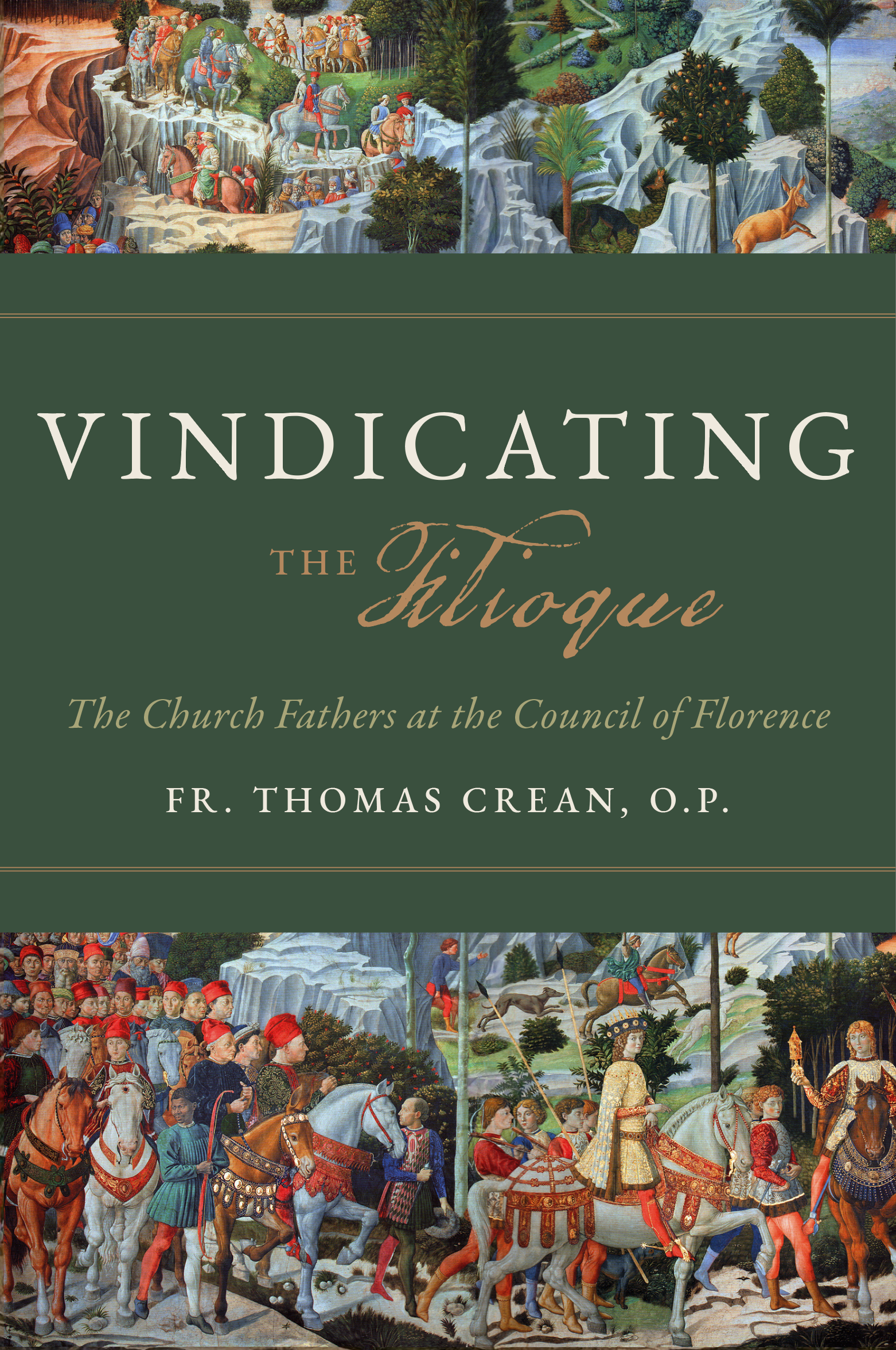
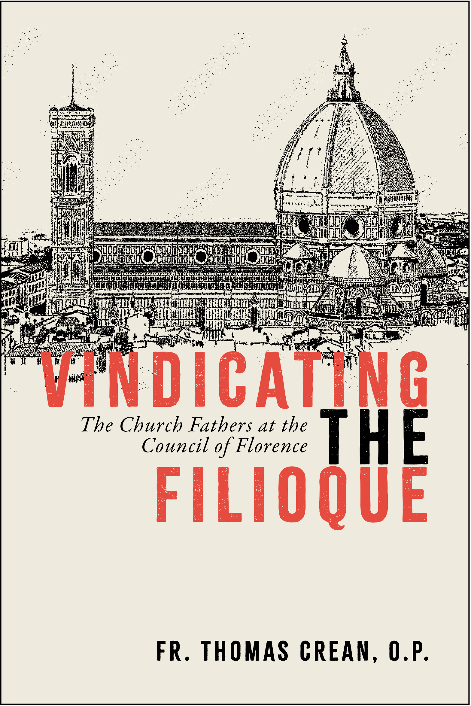
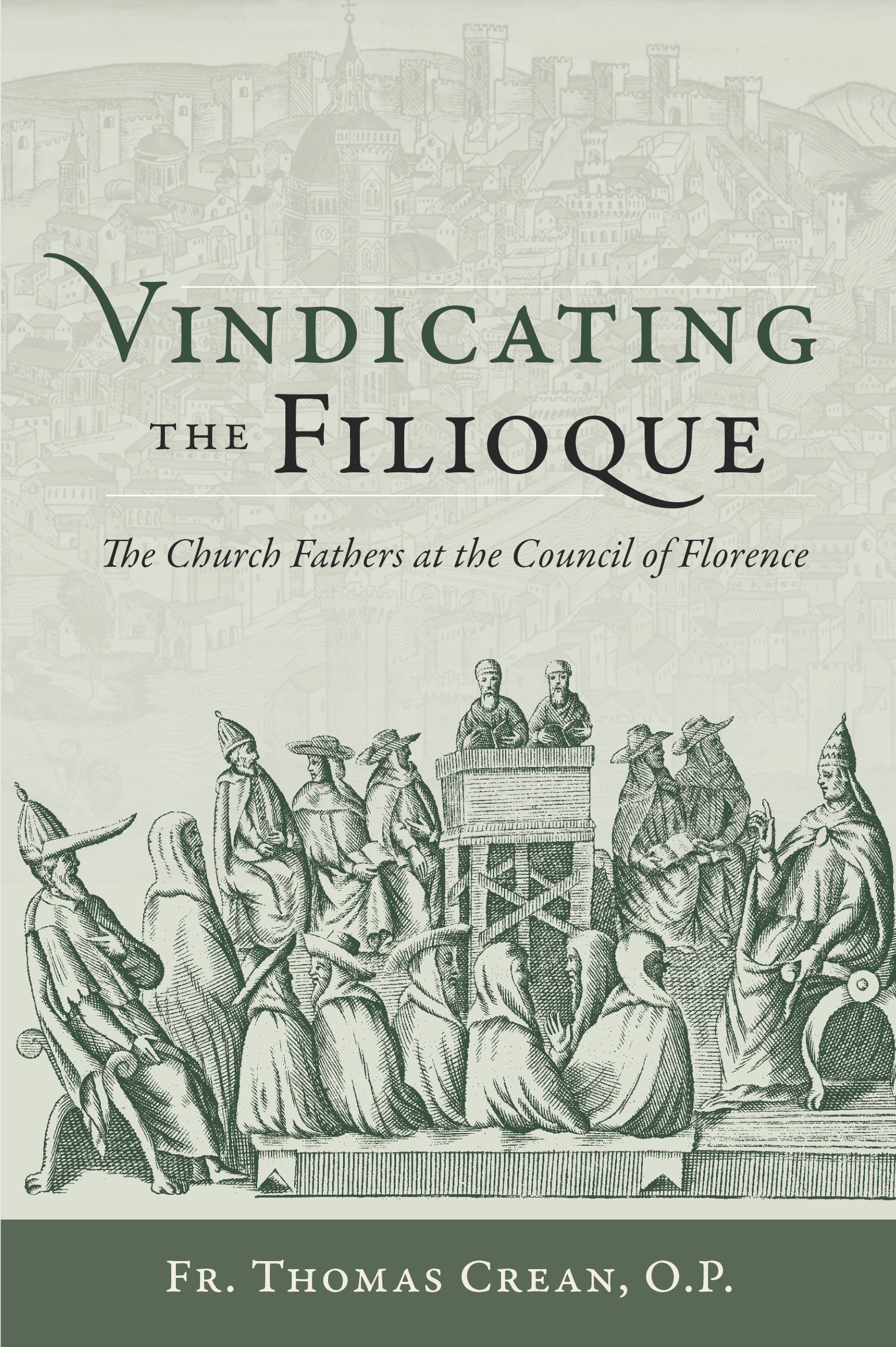
COVER DESIGN
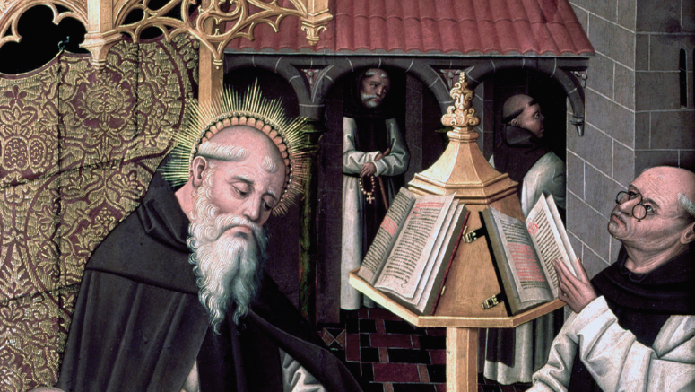
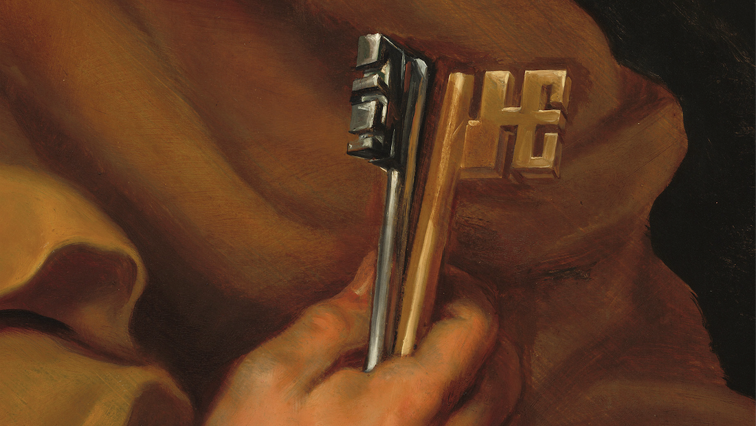
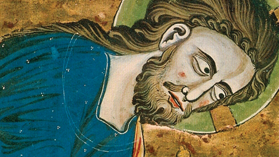
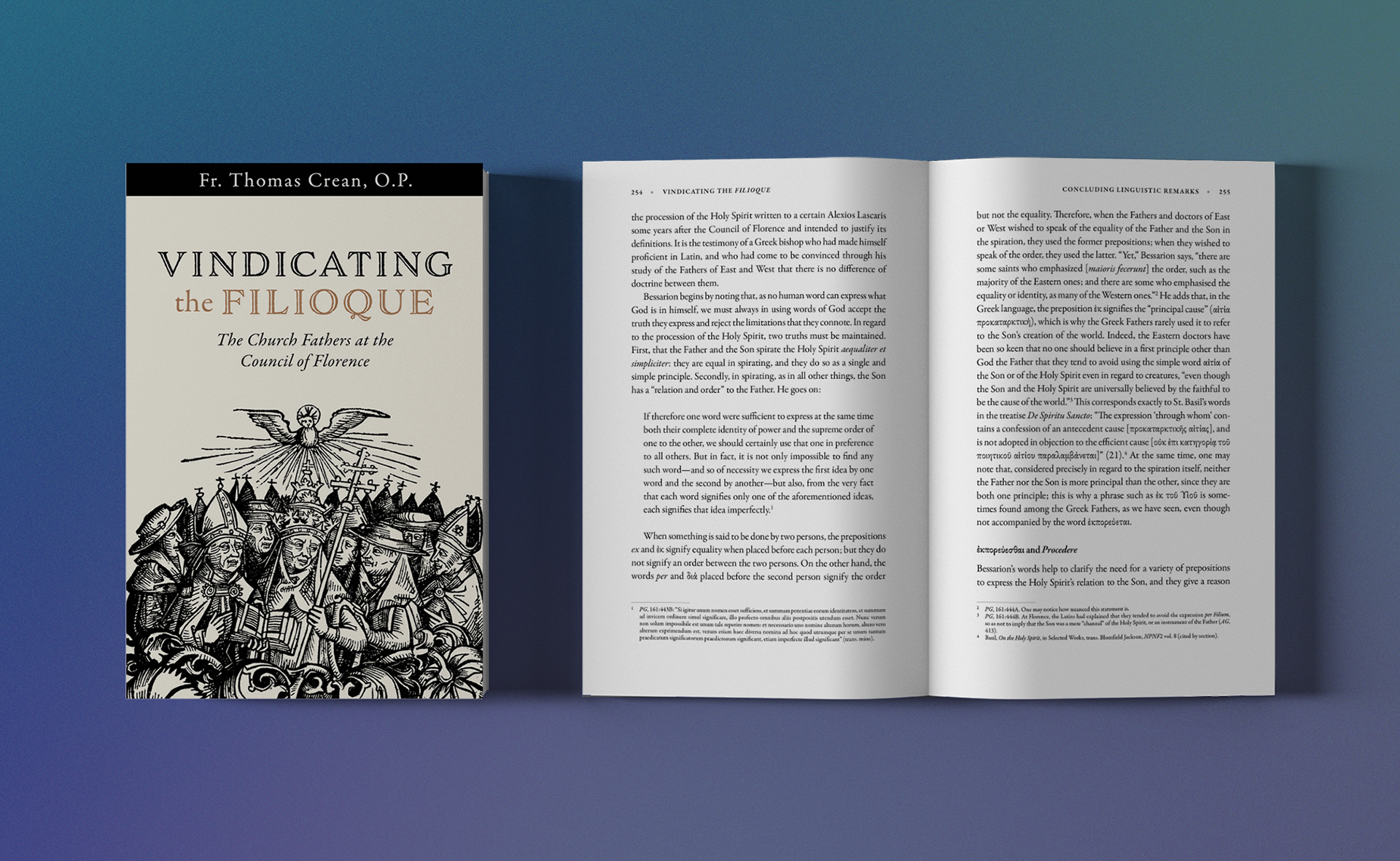
Preliminary research included sourcing fine art with the subject of ecumenical councils as well as sorting through commentaries from the 15-17 centuries. Cover image from the Nuremberg Chronicle.
Initial cover design concepts presented to editorial team for review and direction.